
How to Create a Text with Clipped Background Image in Squarespace
Almost every Squarespace hero puts the image behind the text. This one puts the image inside it.
In this post we'll walk you through, step by step, how we made the headline in RADIATE GLASS work like a window — with a photo showing through the exact shape of the letters. You don't need to know how to code.
What this effect is
Tools you'll need
How it works, in plain terms
The free code, step by step
How to customize it
Quick recap
WHAT THIS EFFECT IS
Look at the two images below. Same headline, same photo — arranged two different ways:
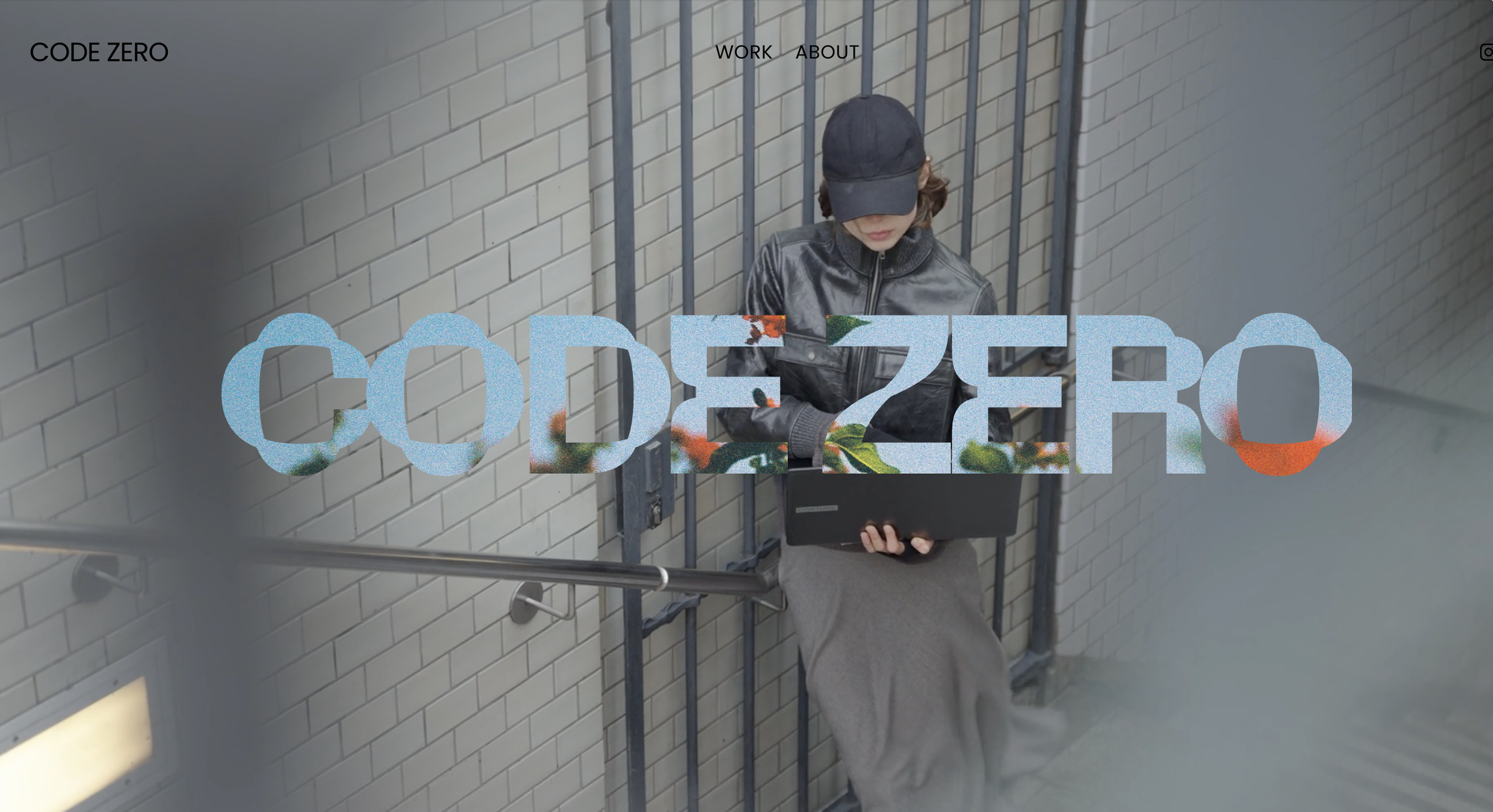
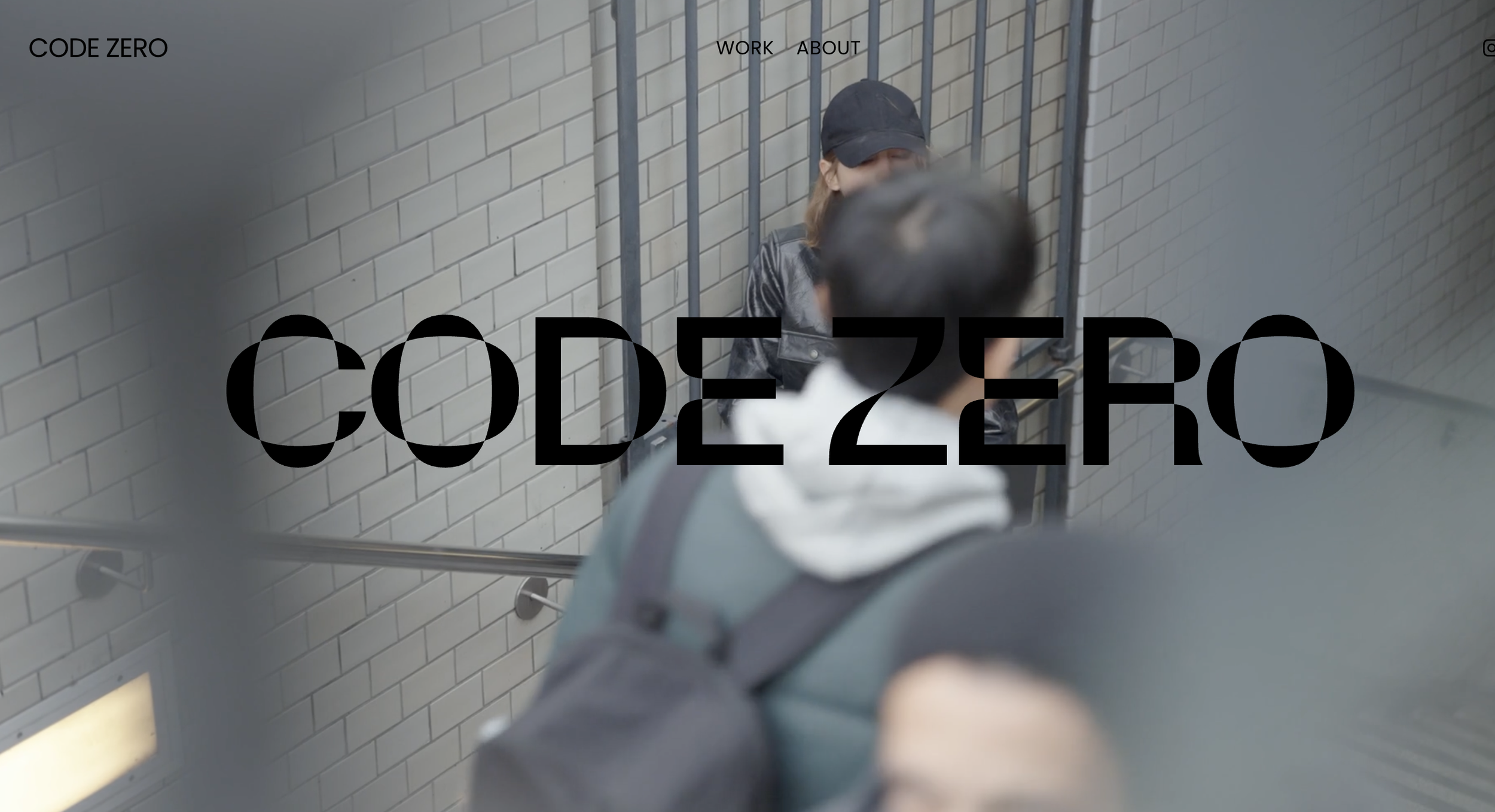
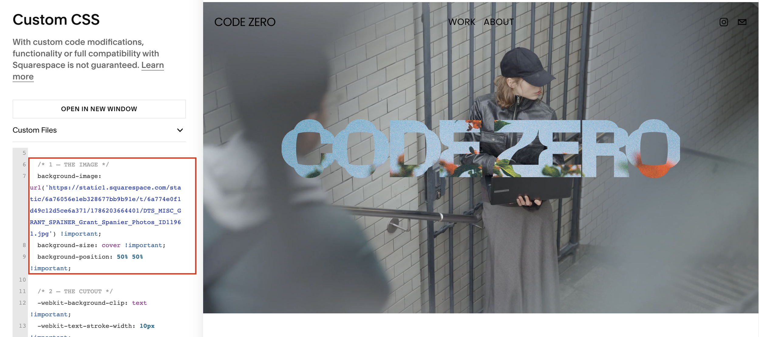
In the first one, the text sits on the image. In the second, the text is the image — the letters act like a cutout, and the photo shows through them.
It's the kind of detail you'll spot on Awwwards-featured sites, and most people assume it needs a canvas library or a video background. It doesn't. It's one CSS property used in a way most designers never try.
TOOLS YOU'LL NEED
Before touching any code, here's everything you should have on hand:
The free Squarespace ID Finder extension — we use it to find the unique "name" of the text block you want to affect, without digging through code by hand
An image with strong tonal contrast — a portrait, a texture, a sky. See the note below before you pick one.
Access to your site's Squarespace panel (Design → Custom CSS)
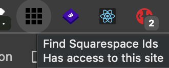
💡 Why this extension and not another one?
It's free, has over 60,000 users, and does exactly one thing: shows you the ID of any block, section, or page on your site with a single click. You don't need to understand code to use it.
HOW IT WORKS, IN PLAIN TERMS
Think of it like a paper stencil held up against a photograph.
Part 1 — We punch out the letters. Normally your headline has a color. Here we tell it to have no color at all — the text turns fully transparent. On its own, that would make the headline disappear.
Part 2 — We put the photo behind the stencil. Then we apply an image to that same text block. The browser only lets that image show through where the letters are, and hides it everywhere else. The result: text-shaped holes with a photo behind them.
That's the whole idea. Two moves — empty out the letters, then fill the hole with a picture.
THE FREE CODE, STEP BY STEP
Step 1 — Copy this code
/* TEXT WITH CLIPPED BACKGROUND IMAGE by Dunagency */

.your-block-id h1 {

  /* 1 — THE IMAGE */
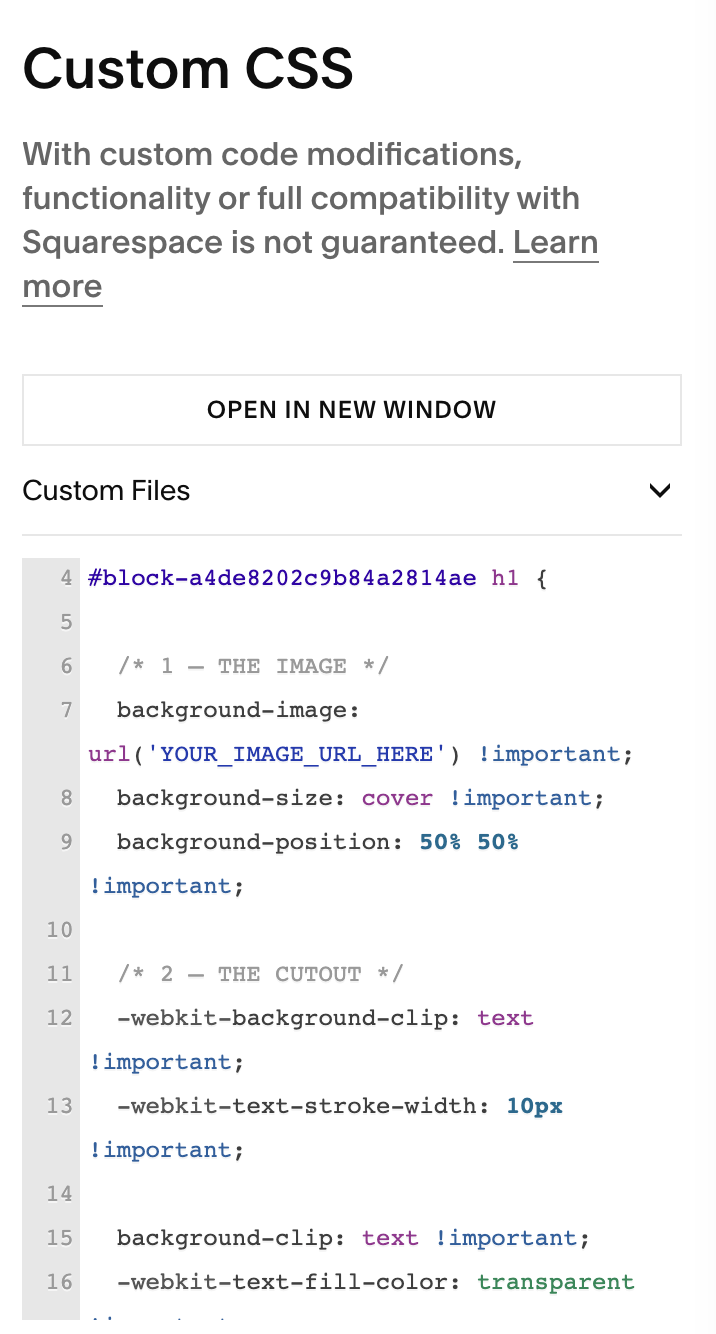
  background-image: url('YOUR_IMAGE_URL_HERE') !important;
  background-size: cover !important;
  background-position: 20% 25% !important;

  /* 2 — THE CUTOUT */
  -webkit-background-clip: text !important;
  background-clip: text !important;
  -webkit-text-fill-color: transparent !important;
  color: transparent !important;
}
You'll be changing exactly two things in it: .your-block-id and YOUR_IMAGE_URL_HERE. Everything else can stay as it is.
Step 2 — Upload your image and get its URL
The image needs to live on the internet somewhere before the code can point at it. The easiest place is inside Squarespace itself:
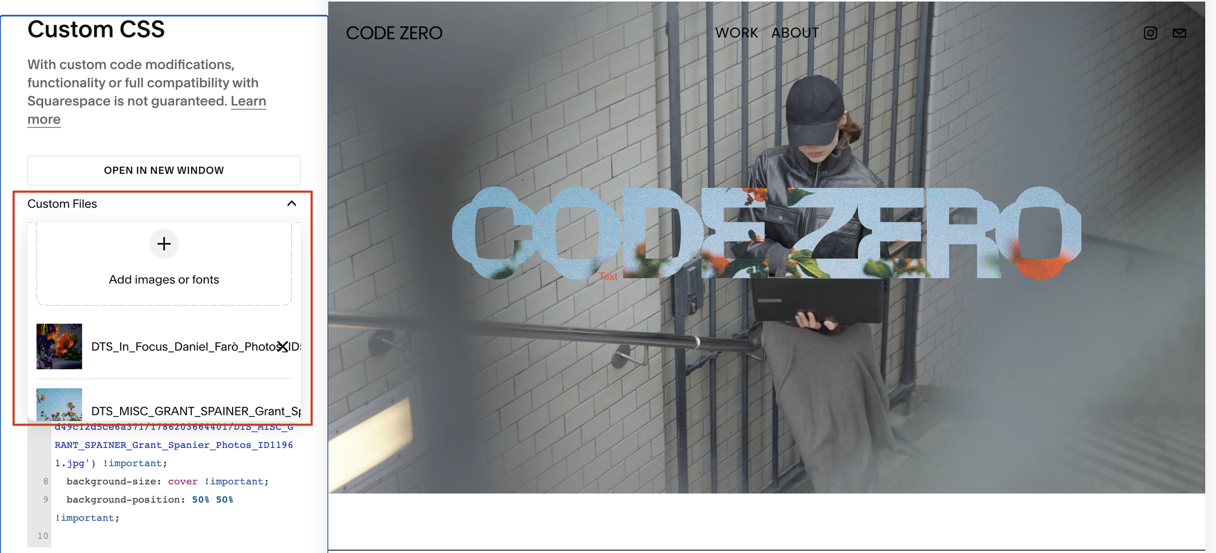
Go to Design → Custom CSS.
Click Manage Custom Files at the bottom of the panel.
Upload your image.
Leave this tab open — you'll come back to it in Step 5.
Step 3 — Find your text block's ID
This is the step that usually trips people up, so let's take it slow:
Open your site in Chrome and click the Squarespace ID Finder icon in your extensions bar.
Colored labels will appear over your page: red for blocks, blue for sections, yellow for whole pages.
Find the text block holding your headline and click its red label.
The ID gets copied automatically. It'll look something like #block-yui_3_17_2_1_1712345678901_23456.
Step 4 — Turn that ID into the class the code needs
The extension hands you an ID (starting with #block-). This snippet targets the block's outer wrapper instead, which is a class. Converting between the two is a straight find-and-replace:
The extension gives you: #block-yui_3_17_2_1_1712345678901_23456
The code needs: .fe-block-yui_3_17_2_1_1712345678901_23456
Swap the #block- at the front for .fe-block-, keep the long string after it exactly as-is, and paste the result over .your-block-id in the code.
🛑 Don't drop the dot. .fe-block-... starts with a period, not a #. Getting this one character wrong is the single most common reason the effect appears to do nothing at all.
Step 5 — Paste the code and insert your image
Back in Design → Custom CSS, paste the full code in.
Then delete the placeholder text YOUR_IMAGE_URL_HERE (leave the quote marks around it), put your cursor between them, open Manage Custom Files, and click your uploaded image. Squarespace drops the correct URL right where your cursor is.
🛑 If you're using a Code Block instead (rather than the Custom CSS panel), two things change: you need to wrap the whole code in <style> and </style> tags, and Manage Custom Files won't be available — you'll have to paste the image URL in by hand.
Step 6 — Move the image around until it looks right
Save, then look at your headline. Chances are the part of the photo showing through isn't the part you want.
That's what background-position: 20% 25% controls. The first number moves the image left and right, the second moves it up and down — both from 0% to 100%.
Change the numbers, save, look. Repeat until the strongest part of your photo lands inside the letters. This is 90% of the effect — it's the difference between "interesting" and "why is there a blurry elbow in my O."
HOW TO CUSTOMIZE IT
These are the three things most people change:
The image. The single biggest lever. Swapping the photo changes the entire mood of the section, and no amount of code tuning will rescue a low-contrast one. If the headline looks muddy, change the picture before you change anything else.
The crop (background-position). Covered in Step 6, but worth repeating: small percentage changes make a big visual difference. It's art direction, not setup.
Mobile. Your headline breaks onto different lines on a phone, which means the crop that looked perfect on desktop often doesn't. Check your site on mobile before publishing — and if it's off, you can set a different background-position just for small screens.
This is the simplified version of a technique we built out fully for RADIATE GLASS, a Squarespace template designed for founders and studios who want their site to feel editorial, not templated. In the full build, the same effect is parametrized — swap the image, the stroke, the shadow depth, and the mobile behavior by editing a handful of CSS variables, without touching the underlying code.
If you want to see the effect in its finished form — plus the rest of what makes RADIATE GLASS different — take a look at the template here.
And if you'd rather get snippets like this one before anyone else, join our list — we send these out as we build them, not after.
Have a version of this running on your own site? Tag @dunagency — we'd love to see it.