
How to Create Horizontal Scrolling Sections in Squarespace
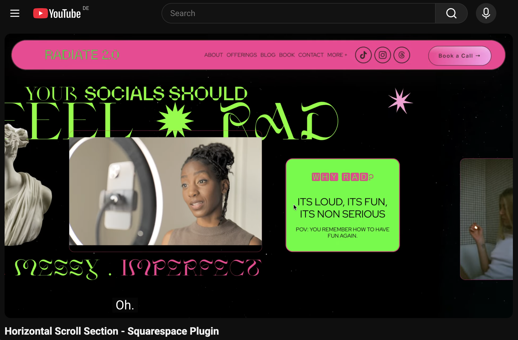
Your Squarespace website already knows how to scroll down.
Groundbreaking.
Now let’s send it sideways.
A horizontal scrolling section changes the direction of your content as visitors move through the page. Instead of every section dropping underneath the last, selected panels travel across the screen in one connected sequence.
The result?
A scroll that feels more editorial, more interactive, and considerably less template-y.
Use it to showcase portfolio projects, product collections, case studies, services, team members, processes, campaigns, or any content that deserves more than another polite vertical stack.
And before you open sixteen tabs searching for how to create horizontal scrolling sections in Squarespace, take a breath.
Our dunagency Horizontal Scroll section Plugin gives you the ready-to-use custom code needed to create the effect without building the sideways engine yourself.
Full code.
Step-by-step installation.
Maximum horizontal energy.
✹ GET THE HORIZONTAL SCROLL SECTION SQUARESPACE PLUGIN
First Things First: What Is Horizontal Scrolling?
A horizontal scrolling section moves content from one side of the screen to the other.
Depending on the setup, visitors may continue using their usual mouse wheel, trackpad, or scrolling gesture. When they reach the horizontal sequence, their scrolling progress moves the selected sections sideways.
Once the final panel has appeared, the page continues downward as normal.
No sudden navigation detour.
No asking visitors to perform finger gymnastics.
Just one unexpected change of direction.
A horizontal scroll website effect can be used to:
Showcase portfolio projects
Present a product collection
Explain a process step by step
Introduce services
Display client results
Build a brand timeline
Reveal campaign visuals
Feature team members
Organise course modules
Create a digital lookbook
Turn a long page into a visual story
The movement looks impressive, but the real power is in the sequence.
Horizontal scrolling lets you decide what visitors see first, what appears next, and how every panel connects to the one before it.
Why Horizontal Scroll Hits Different ✦
Most websites follow the same rhythm.
Scroll.
Section.
Scroll.
Another section.
Perfectly functional. Mildly predictable.
Horizontal scrolling gives the page a plot twist.
It changes the pace for one carefully chosen moment, making visitors slow down and pay attention without turning the entire website into an experimental art installation.
It gives every panel a proper moment
Horizontal layouts create more visual space for each project, product, image, or message.
Instead of squeezing five ideas into one grid, you can give each one its own panel.
One idea.
One visual.
One moment to glow.
It makes connected content feel connected
A process, timeline, portfolio, or product collection already has a natural order.
Horizontal movement reinforces that relationship.
Visitors do not experience the panels as random sections. They understand that each one is part of the same story.
It breaks up long pages
A long sales or service page can start feeling repetitive when every section follows the same vertical layout.
A horizontal sequence introduces a new rhythm and creates a visual milestone inside the page.
Very useful when your site needs variety but not another animation flying in from the ceiling.
It makes Squarespace feel more custom
Squarespace provides the structure.
Custom code brings the extra ᴳᴸᴼᵂ.
Horizontal scrolling adds the kind of interaction often seen across editorial sites, creative portfolios, campaign pages, and more bespoke digital experiences.
Your website still runs on Squarespace.
It simply stops behaving like it followed the default choreography.
How Does Horizontal Scroll Work in Squarespace?
A horizontal scroll effect usually combines regular Squarespace sections with custom CSS and JavaScript.
The CSS helps control:
The horizontal layout
Panel widths
Positioning
Overflow
Spacing
Responsive behaviour
The appearance of the scroll track
The JavaScript can connect the visitor’s scrolling progress to the sideways movement and calculate how far the horizontal sequence needs to travel.
A basic swipeable row may only require a horizontally overflowing container.
A full-width sequence that responds to normal page scrolling usually needs a more complete setup.
That is why one tiny CSS snippet from a forum may not deliver the cinematic masterpiece you had in mind.
Tiny snippet.
Enormous expectations.
Meet our Dunagency Horizontal Scroll Premium Plugin ✹
Our Dunagency Horizontal Scroll Plugin is a ready-to-use custom-code solution created for Squarespace.
You design your sections using the familiar Squarespace editor.
Add your:
Images
Headlines
Copy
Buttons
Backgrounds
Videos
Products
Forms
Brand colours
Oversized typography, obviously
The code handles the horizontal movement.
You still install custom code, but you do not have to invent it, calculate the entire interaction, or spend your evening negotiating with JavaScript.
Dun Agency plugins are designed as customizable creative code snippets with installation guidance, helping Squarespace creators add more distinctive functionality without developing every feature from zero.
You bring the creative direction.
We bring the sideways engine.
Ta-da!
Want to see the movement before giving your own page the sideways treatment?
▶ WATCH THE HORIZONTAL SCROLL VIDEO
Where to Use Horizontal Scrolling on Your Website
Horizontal scrolling works best when the content belongs to one connected sequence.
Not every section needs to travel sideways.
Some sections are perfectly happy going down.
Choose a moment where the change in direction strengthens the story, helps visitors compare information, or gives strong visuals more room to exist.
Here are the layouts officially ready for their horizontal era.
1. Horizontal Scrolling Portfolios
A horizontal scrolling portfolio in Squarespace allows every project to occupy a larger portion of the screen.
Instead of shrinking your best work into a tiny grid, each panel can include:
A full-width project image
The project title
A short description
The creative discipline
A project number
A link to the complete case study
This layout works beautifully for:
Photographers
Graphic designers
Art directors
Architects
Interior designers
Illustrators
Stylists
Creative studios
Web designers
The visitor experiences your work as a curated collection rather than a crowded gallery wall.
More exhibition.
Less thumbnail soup.
2. Product Collections and Lookbooks
Give every product its own panel.
A horizontal product sequence can combine:
Product photography
Product names
Short benefits
Prices
Shop buttons
Colour options
Lifestyle imagery
This works especially well for:
Product launches
Capsule collections
Seasonal edits
Featured products
Fashion lookbooks
Beauty collections
Digital products
Related product families
Use the horizontal section to create excitement around the collection, then connect every panel to the relevant product page.
The result feels more like a campaign.
Less like a spreadsheet wearing product photos.
3. Case Studies
Case studies already have a natural sequence.
Challenge.
Strategy.
Creative direction.
Execution.
Results.
A horizontal scroll lets each chapter appear as its own visual moment.
You can use one panel for the problem, another for the process, and another for the final work.
This helps visitors follow the story without facing one giant wall of text.
Use concise copy inside the horizontal sequence, then link to the full case study for anyone ready to investigate every delicious detail.
4. Your Process
Turn your process into a visual journey.
For example:
① Discover
② Define
③ Design
④ Develop
⑤ Deliver
Horizontal movement makes every stage feel connected to the next.
It works particularly well for:
Agencies
Consultants
Coaches
Photographers
Designers
Event planners
Course creators
Service businesses
Your process is often part of what makes your offer valuable.
Do not bury it beneath a paragraph titled “How It Works.”
Give the method its own stage.
5. Brand Storytelling
Your brand story does not need to live inside one heroic About-page paragraph.
Use a horizontal sequence to reveal:
How the business began
Important milestones
Behind-the-scenes images
Brand values
Identity changes
Press features
Achievements
The next chapter
Each panel can represent a different year, idea, turning point, or era.
Less corporate timeline.
More digital origin story.
6. Service Showcases
Use one horizontal panel for each service.
Every panel can include:
The service name
A short description
A supporting image
Key deliverables
A starting price
A call-to-action
This gives every offer more presence while keeping related services inside one clear sequence.
It also saves visitors from scrolling through six nearly identical vertical sections wondering whether they have accidentally seen the same service twice.
7. Testimonials and Client Results
Testimonials deserve better than a tiny slider everyone ignores.
A horizontal layout can turn every review into a mini client story.
Combine the quote with:
A project image
A client logo
A measurable result
A client photograph
A link to the full case study
Choose a small number of strong testimonials.
You do not need to upload every nice thing anyone has ever said about you.
Curated confidence always lands harder.
8. Team Introductions
Give every team member a little more room than one tiny headshot in a grid.
Each panel might include:
A portrait
Their name
Their role
A short bio
Their specialism
One charmingly unnecessary personal fact
This is a particularly strong layout for small studios and creative teams where personality is part of the brand.
Let the people behind the business feel like actual people.
Revolutionary.
9. Courses, Programs, and Memberships
Horizontal scrolling can help potential customers understand the structure of an offer.
Use one panel for each:
Module
Week
Phase
Outcome
Bonus
Membership benefit
The sequence makes the journey feel clear and tangible.
Just keep the text focused.
Nobody wants to read an entire course curriculum while moving through a sideways tunnel.
10. Campaign and Launch Pages
A horizontal sequence can become the main visual moment of a campaign page.
Use it for:
Product launches
Events
Collaborations
Seasonal campaigns
New service reveals
Limited collections
Digital exhibitions
Portfolio launches
The interaction gives the campaign a distinct identity without requiring you to redesign your entire website.
One strategic plot twist.
Plenty of impact.
Horizontal Scroll vs Carousel: What Is the Difference?
A carousel usually displays several compact items inside one block.
Visitors click arrows, use navigation dots, or swipe between slides.
A horizontal scrolling section can contain complete Squarespace sections, each with its own layout, background, blocks, typography, buttons, and visual composition.
Use a carousel when:
The content is compact
The component occupies a small area
Visitors should browse items independently
A familiar interaction is the priority
Every slide follows a similar structure
Use horizontal scrolling sections when:
The content forms a connected story
Each panel needs a custom layout
Large visuals need more room
The transition is part of the experience
You want one immersive moment inside the page
Both can work beautifully.
Only one sends your entire section sideways.
Squarespace Horizontal Scroll CSS
You may have arrived here after searching for Squarespace horizontal scroll CSS.
CSS can create a horizontal row by changing the direction of a container and allowing content to overflow sideways.
A simplified example might look something like this:
.horizontal-track {
  display: flex;
  overflow-x: auto;
}

.horizontal-panel {
  min-width: 100vw;
}
This creates a basic row of full-width panels that can move horizontally.
Cute start.
Not the full show.
A scroll-driven horizontal sequence may also need code to:
Measure the total width
Connect vertical scroll progress to horizontal movement
Control where the sequence begins
Control where it ends
Keep the track in view
Respond to browser resizing
Restore vertical page flow
Adapt the effect for mobile
So yes, CSS can help create horizontal scrolling.
But a polished full-section experience generally needs a little more orchestration.
How to Plan a Horizontal Scrolling Section
Before adding code, decide what the sequence is actually doing.
Ask yourself:
Which sections belong together?
What should visitors understand by the end?
Does every panel contain one clear idea?
Is the horizontal movement helping the story?
How many panels are genuinely necessary?
What should happen after the final section?
How will the content work on mobile?
We fully support visual drama.
Strategic visual drama wins.
Keep one main idea per panel
Horizontal panels work best when the content is easy to understand quickly.
Try combining:
One headline
One strong visual
One short explanation
One clear action
Avoid turning every panel into a miniature homepage.
Show that more content is coming
Visitors should understand that the sequence continues sideways.
Visual cues might include:
A visible edge of the next panel
A panel number
A progress indicator
A “keep scrolling” prompt
Directional typography
An arrow
A composition that leads toward the screen edge
The interaction should feel discoverable.
Not hidden like a design-school entrance exam.
Keep the sequence tight
Every additional panel increases the amount of scrolling required before visitors return to the rest of the page.
Three to six strong panels will often feel more intentional than fifteen sections desperately refusing to end.
Edit ruthlessly.
Your scroll deserves pacing.
Horizontal Scroll and User Experience
Creative scrolling should make the website more engaging without making it harder to use.
The effect should feel like a delightful change of pace, not an unexpected change in gravity.
Keep important navigation familiar
Your main navigation, legal links, essential information, and core conversion paths should remain easy to find.
Horizontal scrolling should support the website.
It should not become the entire operating system.
Keep copy concise
Horizontal layouts are excellent for:
Headlines
Short descriptions
Statistics
Captions
Quotes
Calls-to-action
They are less suitable for several long paragraphs that require visitors to read and move in multiple directions.
Give visitors a clear exit
The page should enter and leave the horizontal sequence smoothly.
Visitors need to understand when the effect begins, when it ends, and how to continue down the page.
Surprise them.
Do not trap them in a digital hallway.
Making Horizontal Scroll More Accessible
Horizontal layouts can be used responsibly, but accessibility needs to be part of the design from the beginning.
WCAG guidance requires content to reflow without forcing users to scroll in two directions to read ordinary text. For horizontally scrolling panel layouts, the information inside each individual panel should remain readable within its available width.
Keep each panel readable
Visitors may move horizontally between panels, but they should not also need to scroll sideways inside one panel to finish reading a sentence.
Keep text blocks responsive and avoid rigid widths that prevent content from reflowing.
Maintain a logical content order
The underlying page structure should still make sense without the visual movement.
This supports:
Screen readers
Search engines
Keyboard navigation
Simplified mobile layouts
Situations where the script does not load
The design may travel sideways.
The content should still know which way is forward.
Preserve keyboard access
Buttons, links, forms, and other interactive elements need to remain reachable through keyboard navigation.
Do not let a visual effect quietly remove access to the actual content.
Avoid excessive motion
If the horizontal sequence moves very quickly or reacts too aggressively to scrolling, it may feel uncomfortable or difficult to follow.
Keep the movement controlled and allow a calmer fallback where the implementation supports reduced-motion preferences.
Not every visitor ordered the full choreography.
Squarespace Horizontal Scroll on Mobile
A Squarespace horizontal scroll mobile layout deserves its own plan.
Desktop screens have room for large imagery, oversized type, and cinematic panel transitions.
Phones have less space, touch controls, and browser bars that change the available viewport while someone scrolls.
A responsive version may:
Return the panels to a vertical layout
Allow direct touch swiping
Reduce panel widths
Shorten the horizontal sequence
Resize large headings
Remove decorative elements
Reduce section padding
Simplify the movement
Disable the scroll-driven effect
Turning the sequence back into a vertical layout on mobile is often the best option.
The content remains available.
The experience remains easy.
Nothing gets crushed into a tiny sideways sandwich.
Responsive design is not about forcing the same interaction onto every screen.
It is about giving every screen the version that works.
How to Install the Horizontal Scroll Plugin in Squarespace 7.1
The exact steps should always follow the installation guide included with your plugin.
We describe our plugins as ready-to-use and customizable, with step-by-step installation guidance. The site’s FAQ also notes that some basic familiarity with custom CSS may be useful.
The general workflow looks like this.
Step 1: Download the plugin files
After purchasing the plugin, download the supplied code and open the installation guide.
Keep one untouched copy of the original files somewhere safe.
Your future self will thank you when one experimental edit becomes seven experimental edits.
Step 2: Build your sections
Create the Squarespace sections you want to include in the horizontal sequence.
Add and style your:
Images
Text
Buttons
Videos
Products
Backgrounds
Shapes
Forms
Other supported blocks
Build the content first.
Then add the sideways magic.
This makes it easier to judge whether every panel has the right amount of content and whether the complete sequence tells one clear story.
Step 3: Identify the participating sections
Follow the supplied instructions to mark the sections included in the effect.
This may involve section identifiers, anchor links, custom names, or another method included with the plugin.
Copy the required values carefully.
Custom code is wonderfully literal.
It has absolutely no interest in what you meant spiritually.
Step 4: Add the CSS
Paste the supplied style code into the location specified by the plugin guide.
Squarespace recommends using the Custom CSS Editor for styling rather than placing CSS inside code injection fields.
Only edit the values identified as customizable.
Randomly changing unfamiliar lines is how the glitch goblin gets invited in.
Step 5: Add the JavaScript
If the plugin includes JavaScript, paste it into the code area specified in the instructions.
Squarespace currently supports code injection on Core, Plus, Advanced, and certain legacy plans. Its Basic plan does not run JavaScript or iframe code added through premium custom-code features.
Check your Squarespace plan before installation.
Plan names and included features can change, so use Squarespace’s current plan information as the final reference.
Step 6: Save and test the live page
Some custom-code effects may not display fully while you are editing the page.
Save your changes and test the preview or published version.
Review the sequence using:
A mouse
A trackpad
Keyboard navigation
A tablet
A mobile phone
Different browser sizes
Browser zoom
Also check the sections immediately before and after the horizontal sequence.
The entrance and exit should feel smooth.
No awkward jumps.
No rogue white space.
No section leaving the party through a wall.
Step 7: Review the mobile version
Check:
Headline wrapping
Image cropping
Button visibility
Text size
Panel height
Touch behaviour
Page overflow
The return to vertical scrolling
Do not rely exclusively on the Squarespace mobile preview.
Real phones enjoy adding their own creative feedback.
Which Squarespace Plan Do You Need?
The plugin needs a Squarespace plan that supports the custom-code features included in the installation.
Custom CSS is added through Squarespace’s styling tools. JavaScript and code injection require an eligible plan with premium custom-code functionality. Squarespace currently lists code injection for Core, Plus, Advanced, and applicable legacy plans.
Squarespace also notes that code-based customizations fall outside the standard functionality it can guarantee or fully support.
For installation help related to the plugin itself, follow the Dun Agency documentation and product-support process.
Horizontal Scroll Design Tips ✦
The code creates the movement.
Your design gives people a reason to watch it.
Give every panel one clear job
One project.
One product.
One service.
One message.
Horizontal layouts lose their impact when every panel carries six unrelated ideas and a newsletter form.
Use visual consistency
The panels do not need to look identical, but they should feel like part of the same sequence.
Use consistent:
Spacing
Alignment
Typography
Image treatment
Content density
Button styles
Think collection.
Not group project.
Build contrast between panels
Alternate background colours, layouts, type sizes, imagery, or content direction.
Every panel should feel fresh while still belonging to the same brand world.
Design toward the next section
Use images and graphic elements that lead the eye toward the next panel.
Try:
Cropped objects
Directional lines
Arrows
Off-centre typography
A visible edge of the next visual
Subjects looking into the following panel
A little visual breadcrumb.
But make it fashion.
Keep calls-to-action intentional
Not every panel needs a button.
Use calls-to-action where they support a clear next step.
For a portfolio, that might be “View Project.”
For a product, “Shop Now.”
For a service, “See the Details.”
For the final panel, make the main action impossible to miss.
Common Horizontal Scroll Problems
The entire page scrolls sideways
An image, block, or transformed element may be extending beyond the intended horizontal container.
Review:
Fixed-width elements
Oversized images
Section transforms
Overflow settings
Custom margins
The required plugin CSS
Only the intended sequence should travel sideways.
The footer does not need to join.
The sections are not moving
Check that:
The correct sections have been identified
The CSS is in the correct field
The JavaScript is in the correct field
Your Squarespace plan supports the code
The code was copied completely
You are testing the preview or published page
One missing bracket can turn a premium scroll into a very committed still life.
The sequence ends too early
The total scrolling distance may not match the width or number of included panels.
Review the section settings and any customizable values described in the plugin guide.
The content is being cut off
The panel may contain more vertical content than the available screen height.
Try:
Reducing padding
Shortening the copy
Resizing the image
Adjusting the layout
Simplifying the mobile version
Horizontal movement needs room.
So does your headline.
The header covers the content
A fixed Squarespace header or announcement bar reduces the usable screen area.
Check whether the plugin guide includes an offset or section-height adjustment.
It works on desktop but not mobile
This may be intentional.
Many horizontal experiences simplify or return to normal vertical scrolling on smaller screens.
Check the plugin’s mobile instructions before trying to repair a fallback that is already doing its job.
Is Horizontal Scrolling Good for SEO?
Horizontal scrolling does not automatically improve or damage SEO.
The important part is whether the underlying content remains useful, readable, structured, and available without depending entirely on the visual movement.
For stronger SEO:
Use one clear H1
Organize headings logically
Include descriptive text
Add alternative text to meaningful images
Use descriptive button and link labels
Keep the source order logical
Optimize large media files
Make the mobile layout readable
Avoid hiding essential information
Keep page performance in mind
Search engines need content.
Visitors need an experience.
Give them both.
DIY Horizontal Scroll or Ready-to-Use Plugin?
You can build a horizontal scroll effect yourself.
The DIY path may be right for you when:
You are comfortable with CSS and JavaScript
You understand Squarespace section identifiers
You can calculate scroll distances
You know how to create responsive fallbacks
You have time to test several browsers
Debugging brings you a mysterious sense of peace
A ready-to-use plugin may be the better move when:
You want the complete effect
You do not want to develop it from scratch
You prefer a guided installation
You want to keep designing with Squarespace sections
You need a repeatable setup
You would like to launch while the trend is still trending
Our Horizontal Scroll Plugin is full custom code.
It is simply code you do not have to invent.
No code spiral.
No dev drama.
Just add it, style it, and let it slide.
✹ GET THE HORIZONTAL SCROLL SQUARESPACE PLUGIN
Horizontal Scroll Plugin FAQ
Can I create horizontal scrolling sections in Squarespace 7.1?
Yes. Horizontal scrolling sections can be created in Squarespace 7.1 using custom CSS and JavaScript. A ready-to-use plugin packages the code and installation process so you do not need to build the interaction from zero.
Is Dunagency Horizontal Scroll Plugin full code?
Yes. It is a custom-code solution designed to add horizontal scrolling behaviour to selected Squarespace sections.
Do I need coding knowledge?
You do not need to develop the effect yourself. You will need to follow the installation guide, place the code in the correct Squarespace fields, and edit any values identified as customizable.
Can I design the sections in Fluid Engine?
The participating sections can be created and styled using Squarespace’s editor. Follow the product instructions for any specific layout requirements or limitations.
Can I add text, images, and buttons?
The effect is intended to work with designed Squarespace sections. Follow the plugin documentation for the exact blocks and content combinations supported by your version.
Can I add more than one horizontal sequence?
Follow the product guide for the number and arrangement of supported sequences. From a design perspective, keep each sequence focused so the interaction stays special.
Does horizontal scroll work on mobile?
Mobile behaviour depends on the implementation. The layout may simplify, become swipeable, or return to a normal vertical flow on smaller screens.
Will it slow down my website?
Any custom effect can affect performance when combined with oversized images, autoplay videos, or several additional scripts. Optimize your media and test the complete page across devices.
Which Squarespace plan do I need?
You need a Squarespace plan that supports the custom-code features included in the plugin. JavaScript and code injection require an eligible premium plan.
Is there an installation tutorial?
Yes. Follow the tutorial supplied with the plugin for the exact installation steps and supported customizations.
▶ WATCH THE HORIZONTAL SCROLL VIDEO
Ready to Go Sideways? ✹
Your Squarespace website has scrolled down long enough.
Give your portfolio more space.
Turn your process into a journey.
Make product launches feel like campaigns.
Build a section that moves differently because your brand does too.
The Dun Agency Horizontal Scroll Plugin gives you the ready-to-use custom code needed to create the full effect without building it from scratch.
Full code.
Step-by-step guidance.
Big sideways energy.
✹ GET THE HORIZONTAL SCROLL SQUARESPACE PLUGIN
Add your content.
Style your sections.
Let them slide.
Ta-da!